


Fernando Hitzig과 Leonardo G. Milietello는 아르헨티나의 건축가 겸 인테리어 디자이너로, 2006년 부에노스아 이레스에 건축 및 컨설팅 전문 스튜디오 Hitzig Militello Architects(HMA)를 설립했다. 아르헨티나 포함, 국제적으로 건축 관련 여러 상을 받은 HMA는 아르헨티나와 스페인 유명 대학에서 건축뿐만 아니라 디자인과 도시공학 관련 교육 프로그램들도 진행하고 있다. 그들의 최근 프로젝트인 the Birra는 맥주라는 뜻으로, 공간의 이미지와 정체성을 한눈에 볼 수 있도록 디자인된 바(Bar)다.
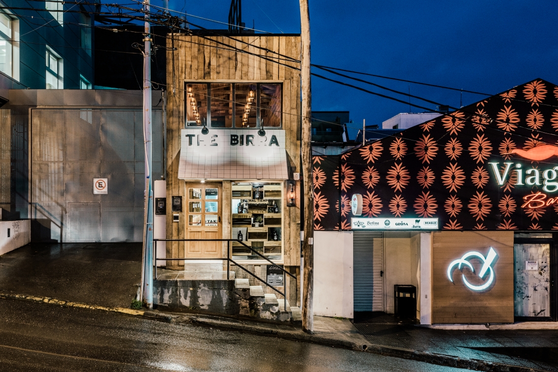
돌과 더불어 인류 최초 도구의 소재였던 목재는 원래가 거칠고 튼튼한 소재다. 이 마초적인 소재는 무궁무진한 가공과정을 거쳐 때로는 부드럽고 때로는 따스하게 실내를 장식하고 있는데, 우리는 가공하지 않은 목재가 주는 러프함을 종종 잊곤 한다. HMA는 목재의 여러 특성 중 거칠고 튼튼한 이미지를 살렸고, 이런 거친 느낌과 이미지에만 너무 치우치지 않도록 화이트 타일의 깔끔하고 잘 정돈된 이미지까지 두 가지 서로 다른 소재를 베이스로 조화롭게 공간을 꾸몄다. 아르헨티나의 창고형 식료품점 Ramos Generales를 모티브로 디자인된 이 바(Bar)에는 Lenga라는 나무를 활용했다. 외관 역시 나무와 타일 두 가지의 소재를 통해 꾸몄는데, 독특하게도 타일로 간판을 제작해 폭이 좁은 파사드임에도 거리에서 충분히 시선을 사로잡는다.
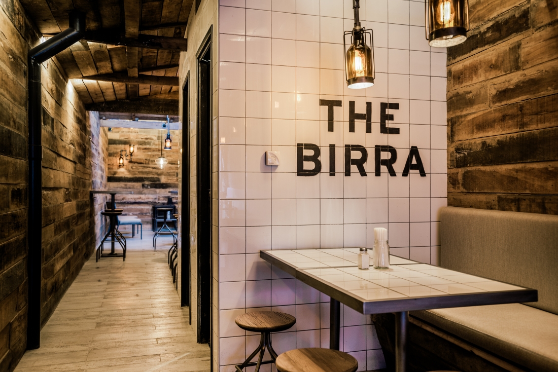
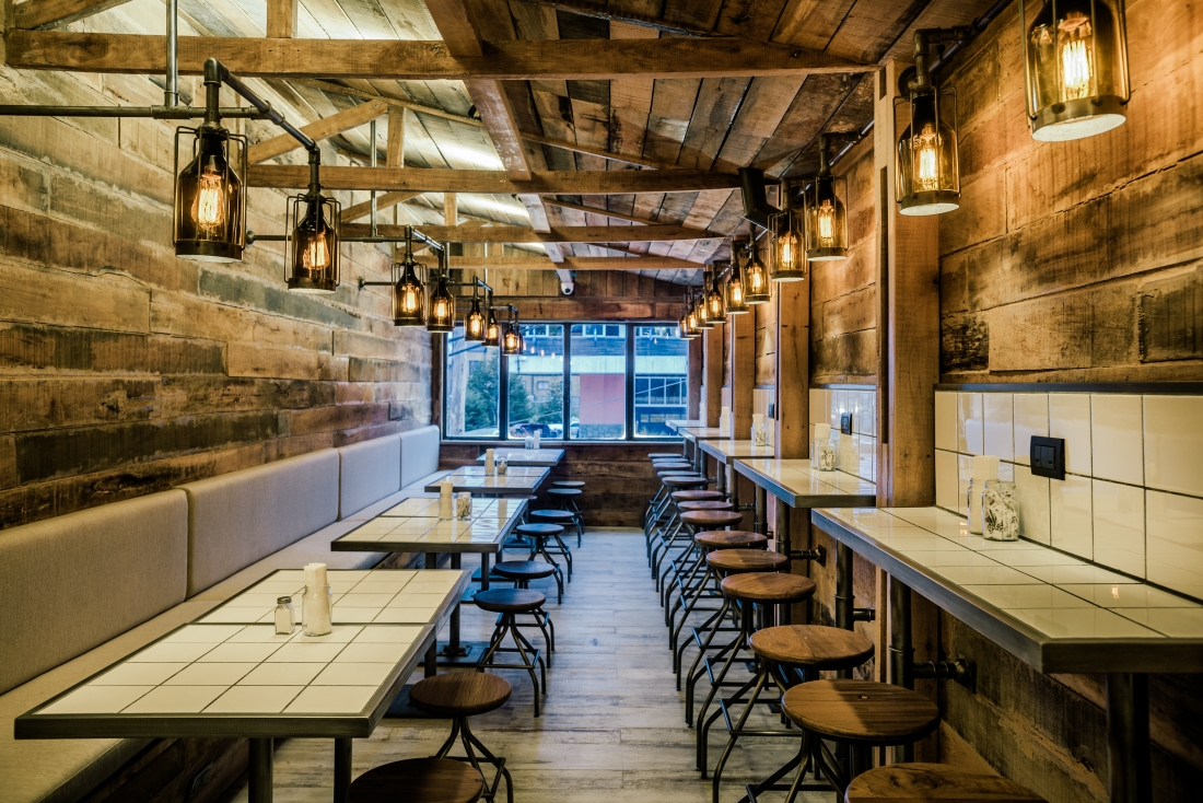
깊숙한 구조의 실내는 두 층으로 이루어져 있다. 1층 입구로 들어서자마자 보이는 왼편에는 조명이 달린 나무 상자에 맥주들을 진열했다. 오른편에는 깔끔한 흰 타일로 카운터를 설치했고 안쪽 깊숙한 곳에는 테이크 아웃 카운터가 별도로 자리했다. 2층은 약 60인 정도를 수용할 수 있는 좌석이 배치되어 있다. 화이트 타일로 테이블을 설계해 시선을 끄는 것과 동시에 전체적으로 목재의 비중이 더 큰 2층 공간의 밸런스를 잡는 등, 디자이너는 끝까지 조화를 놓치지 않았다. 조명과 스토브 외에도 여러 소품은 낡은 것 같은 느낌의 철제를 사용했다. 이런 연출과 더불어 앞뒤로 길고 좁은 구조는 러프하지만 아늑한 느낌을 준다. 협소한 공간을 꾸미는 방식은 대부분 실제 공간보다 넓어 보이는 효과를 내는 데 주력한다. 그러나 디자이너는 The Birra를 통해 협소한 공간에 굳이 넓어 보이는 효과를 주기보다는 좁은 공간은 좁은 대로 안락하고 포근한 분위기를 느낄 수 있도록 디자인했다. 항구도시인 우수아이아에 위치했다는 특징을 잘 캐치해서 실내 공간을 마치 범선 내부처럼 보이도록 꾸몄는데 나무로 구성한 벽이나 통로, 그리고 은은한 조명도 그 역할의 중심에 있다고 볼 수 있겠다.
The project is located in the southernmost city in the world, Ushuaia in Patagonia Argentina. The location was determinant in the choice of materials not only because of the weather but to create the aesthetics we intended to provide to space. Despite being a brewery and hamburger shop, the project started with the idea of a “ramos generales” grocery (traditional Argentine warehouse) through wooden boxes, and its “star” product, beer bottled in growlers. The decision to involve growlers as electrical appliances and wooden boxes as shelving for the product is an example of an intervention with elements specially designed to create an aesthetic proposal that was absolutely binding with the type of products marketed. Lenga, wood from local trees in the area, was chosen as inner siding of the first floor. The blackboard painting was chosen to cover the ground floor, with the aim of being able to be used as communication of the products for sale. The project brings together two materials, wood and white tiles, to balance the palette of materials so that space does not rely solely on wood. The distribution was a great challenge since space only has 90 m2 and a width of Barely 2.75 meters in the ground floor and first floor. In the ground floor, the idea was to build a self-service and take out area, in response to the client request of giving the space a flexibility that will allow a different type of consumer. The first floor is distributed in a range of different uses: low tables, Bars, living.
차주헌
저작권자 ⓒ Deco Journal 무단전재 및 재배포 금지
0개의 댓글
댓글 정렬